Search
Close this search box.

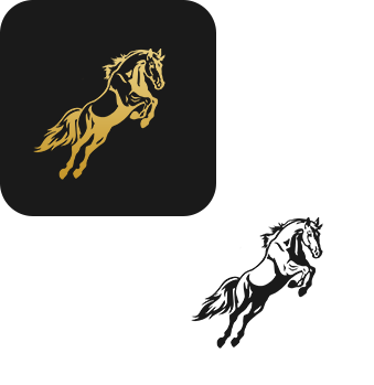
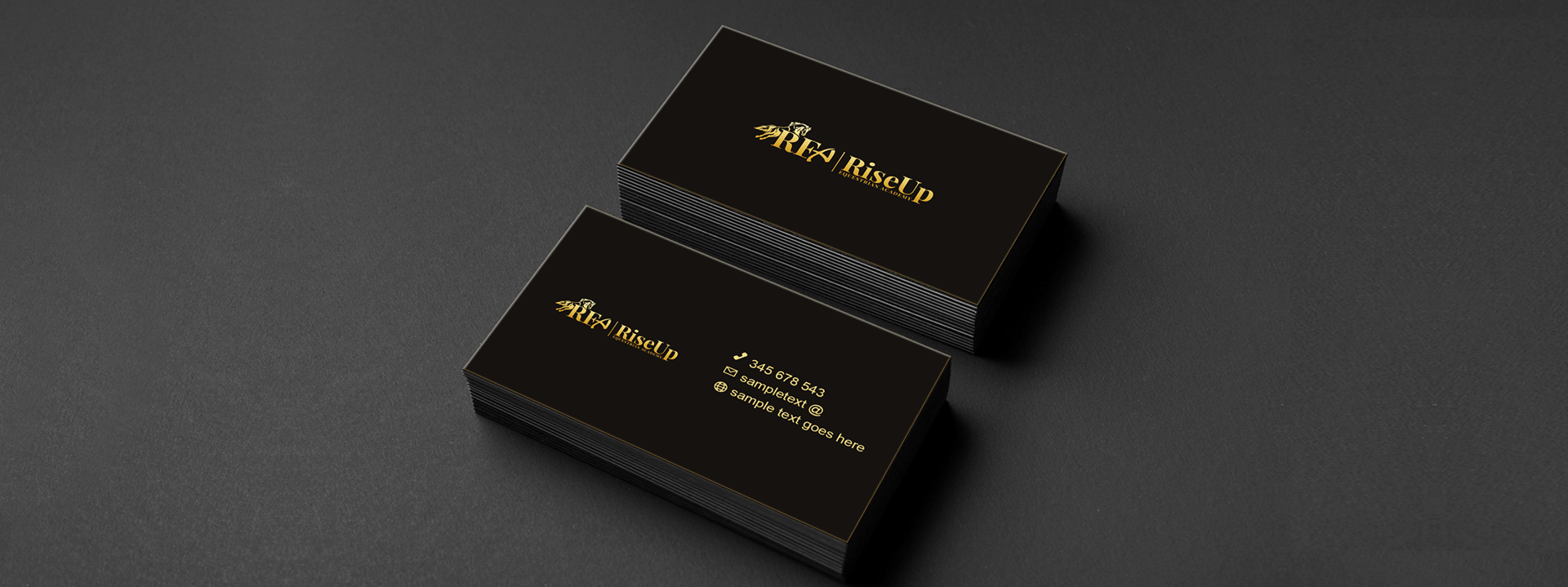
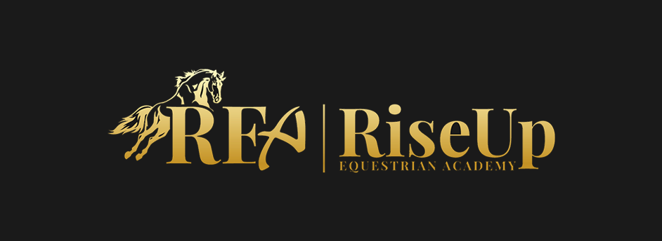
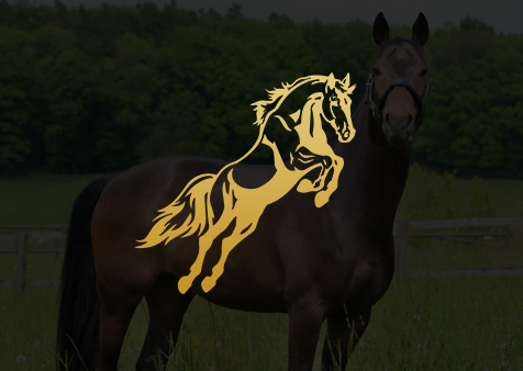
Brand Style Guide & Presentation

Brand guidelines and presentations are essential for a company’s branding. We at DymaxTech were given the challenge to design a seamless logo for “The Rearing Horse”. From the logo to typography, color schemes, and beyond, this case study reflects “The Rearing House’s” visual identity and our organized process of creating a logo that remains strong and memorable.

About Us

DymaxTech is a full-service digital agency committed to delivering cutting-edge solutions that elevate brand identities. Our team of creative experts combines innovation and strategy to craft unique and compelling designs that resonate with our clients’ visions.

Logo

The Rearing House, a prominent equestrian academy, approached DymaxTech with a vision to encapsulate class and friendliness in its logo. The logo prominently features the REQ letters in a blocky yet classy font, strategically placed in front of a rearing horse, symbolizing the academy’s commitment to excellence and growth.

Clear Space

Clear Space

Typography

Icon

The Rearing House, a prominent equestrian academy, approached DymaxTech with a vision to encapsulate class and friendliness in its logo. The logo prominently features the REQ letters in a blocky yet classy font, strategically placed in front of a rearing horse, symbolizing the academy’s commitment to excellence and growth.

Logo Mark & Guide Explanation

A swath of color envelops the REQ letters and the rearing horse, adding a vibrant touch to the logo. This intentional use of color symbolizes the academy’s commitment to diversity and inclusivity.

Primary Color

The primary color palette consists of bold and dynamic hues, reflecting the academy’s vibrant spirit. The carefully chosen colors enhance brand recognition and leave a lasting impression.

#1a1a1a

c

73%

m

67%

y

65%

k

78%

#dfb85e

c

m

y

k

Colour Variation

A range of color variations is provided to accommodate diverse applications, ensuring the logo remains impactful across different backgrounds and mediums.

Final Thoughts

In conclusion, DymaxTech’s collaboration with The Rearing House resulted in a logo that perfectly balances elegance and approachability. The distinctive design, featuring the rearing horse and REQ letters, coupled with a vibrant color palette, creates a lasting and recognizable brand identity. As The Rearing House ventures into the future, we are confident that this logo will serve as a powerful symbol, embodying the academy’s commitment to excellence and inclusivity across diverse platforms and applications.


LET'S WORK TOGETHER

Let's collaborate to create digital marketing strategies that promote your values, help your brand rank on top and generate more revenue.

or

error: