Royal YUM, a full-service restaurant offering an intimate and friendly dining experience, approached DymaxTech to create a distinctive brand identity. The challenge was to design a logo and menu that reflected the restaurant’s cozy atmosphere and catered to a diverse audience, including families, college students, church crowds, and business meetings.
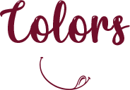
Our approach to the logo design for Royal YUM was inspired by the brand’s desire for intimacy, friendliness, and a cozy atmosphere. Leveraging the “Simply YUM” tongue element, we aimed to create a unique and recognizable logo that captured the essence of a full-service dining experience.
Integrating royal purple hues for sophistication.
Emphasizing the tongue element subtly for brand continuity.
Blending royal colors with warm tones for a cozy feel.
Incorporating playful elements to convey a fun atmosphere.
Utilizing sleek typography and minimalist design.
Highlighting the tongue element creatively to stand out.
For the menu design, our goal was to translate the restaurant’s ambiance onto paper. We aimed to create a visually appealing and easy-to-navigate menu that reflected the diverse offerings suitable for various occasions.
Incorporating royal colors and a classic layout.
Emphasizing high-quality food imagery for an appetizing appeal.
Using warm tones and inviting visuals.
Implementing a balanced layout for a family-friendly aesthetic.
Integrating modern design elements and vibrant accents.
Showcasing a variety of dishes with creative presentation.
#731e41
#F5DC84
#000000
#ffffff
The newly designed logo and menu have received positive feedback from both the client and customers. The cohesive branding has enhanced the overall perception of Royal YUM, attracting a diverse clientele and creating a memorable dining experience.
The collaboration with Royal YUM has been a successful venture, capturing the essence of the restaurant’s intimate and friendly atmosphere. The combination of a distinctive logo, visually appealing menu, carefully chosen fonts, and a harmonious color palette has contributed to a strong and memorable brand identity for Royal YUM.
LET'S WORK TOGETHER
Let's collaborate to create digital marketing strategies that promote your values, help your brand rank on top and generate more revenue.