DymaxTech collaborated with Social Exposure, a dynamic social media agency, to revamp their pitch deck design for a grand relaunch. This case study explores the journey from conceptualization to refinement, showcasing the evolution of a cutting-edge presentation that aligns seamlessly with Social Exposure’s vibrant new branding.
Social Exposure sought a visually captivating portfolio that aligns with its revamped brand identity. Key instructions included vibrant colors, playful design elements, and a departure from conventional layouts.
Iterative adjustments to color schemes, typography, and layout were made according to the client’s feedback. Specific instructions for image replacements, cropping, and the strategic placement of logos and iconography were followed.
DymaxTech received the client's branding guidelines, logo, color palette, and inspirational examples to kick-start the design process.
The major challenge for us was to ensure vibrant and playful design elements while adhering to brand guidelines and ensuring uniformity in color schemes throughout the deck.
To keep everything on track, regular communication was maintained with the client. This way, we get to know about multiple revisions to align design with client expectations. 
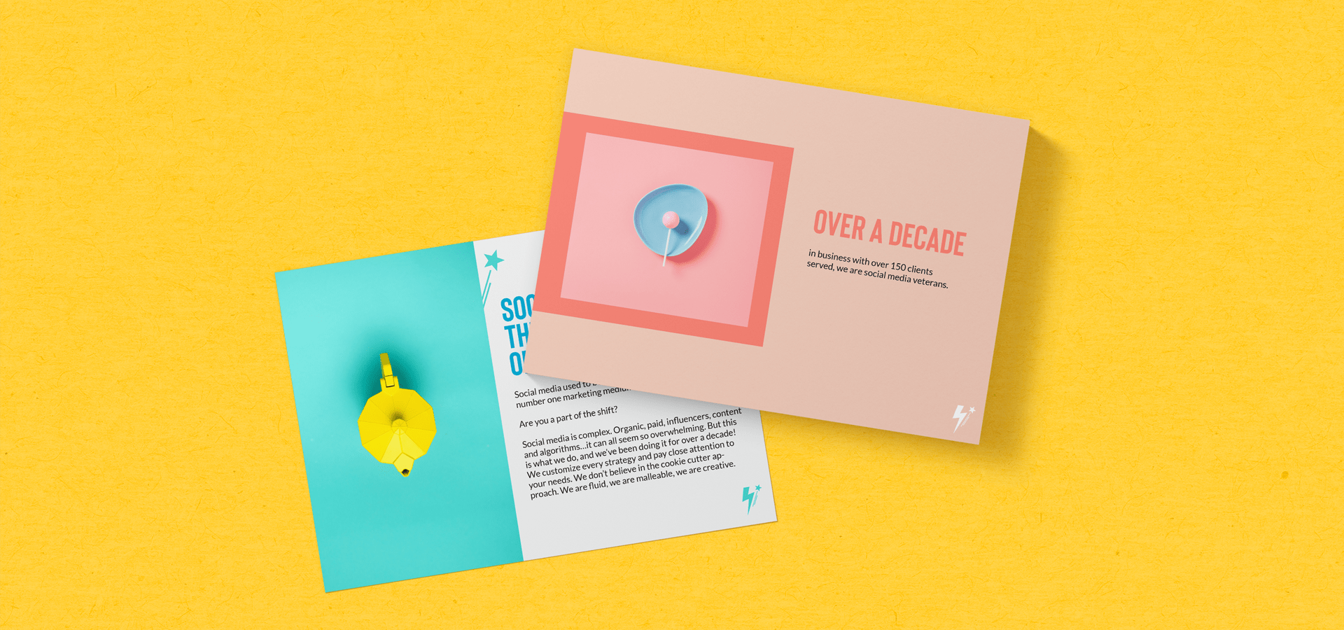
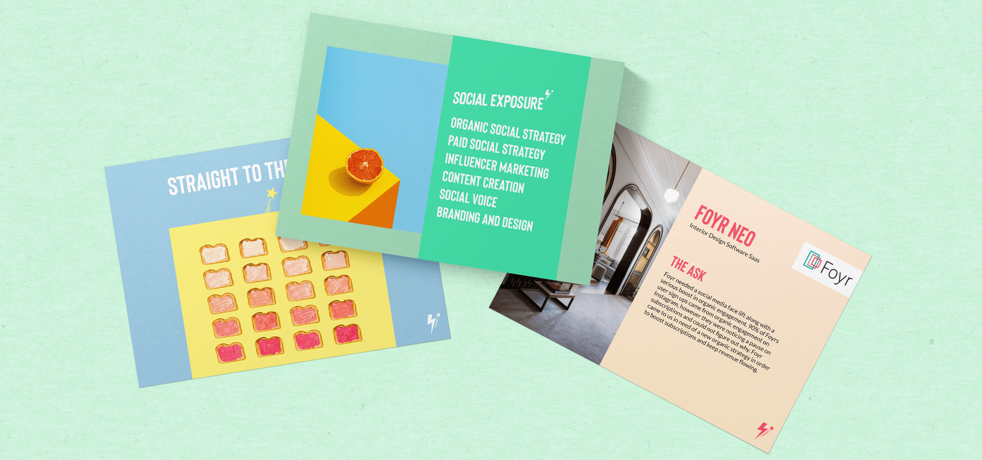
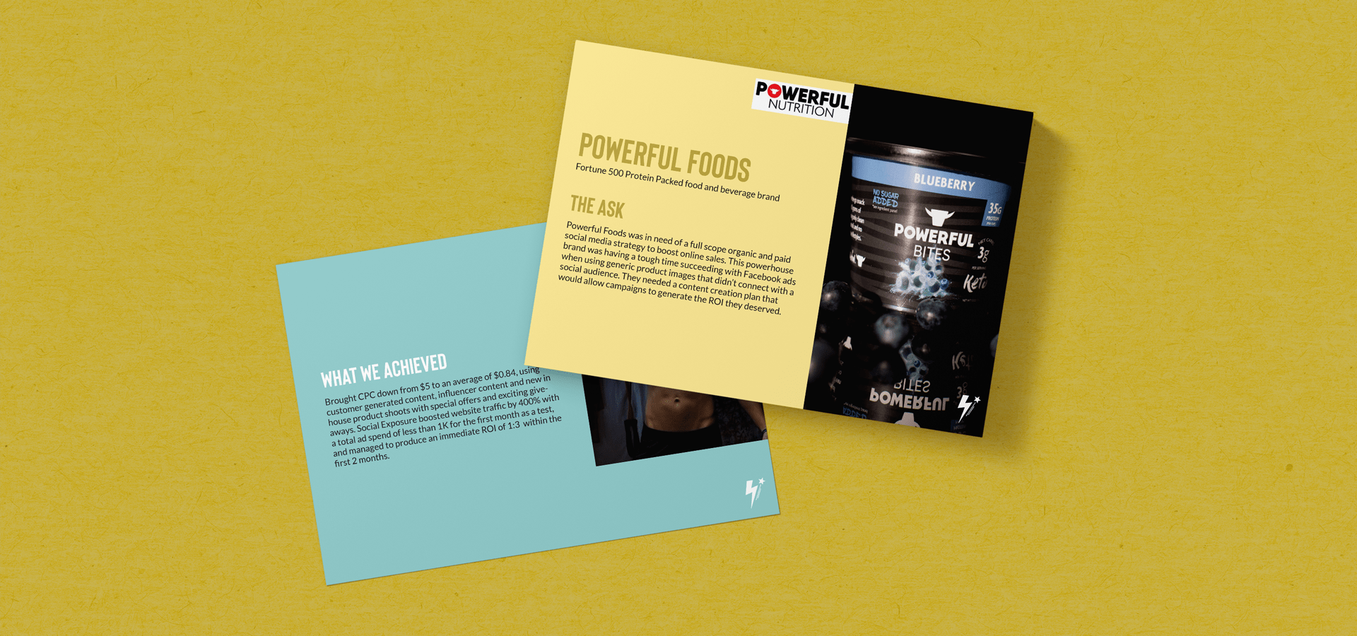
Also, we prioritized the inclusion of Social Exposure's logo, iconography, and brand colors for a cohesive and branded aesthetic.
Turquoise background, Aquamarine color, Slanted Social Exposure logo, and lightning bolt/star iconography.
Splitting The BB samples into two slides for enhanced readability and crafting a thank-you page with high-res imagery and essential contact information.
Segregation of "The Ask" and "What We Achieved" for improved readability and replacing low-resolution client logos with higher-quality alternatives.
Error: Contact form not found.